Visualisations for the US Housing Market


This article is a continuation of the theory piece from a couple of weeks ago which discussed the housing market and why it is so important to investors. I looked at what the housing market represents and how it’s centred around this concept of “stability” -> in order to purchase a house, an individual or family must have a reasonable amount of cash in the bank to invest as the downpayment and the expected stability going forward to match the mortgage payments. It’s a sign of an improved economic situation if the number of home sales in a country is rising and this could have the subsequent effect of strengthening that country’s currency.
This article can be looked at as a form of complementary data visualisation/exploration. I’ve taken the data from US Existing Home Sales over the past 5 years, the raw figures for which can be found here. The aim of the following visualisations is to present this data in its raw format and alongside forex components, such as the US Dollar Index (a measurement of the strength of the USD against a weighted combination of other currencies) and the EURUSD itself.
Visualisations
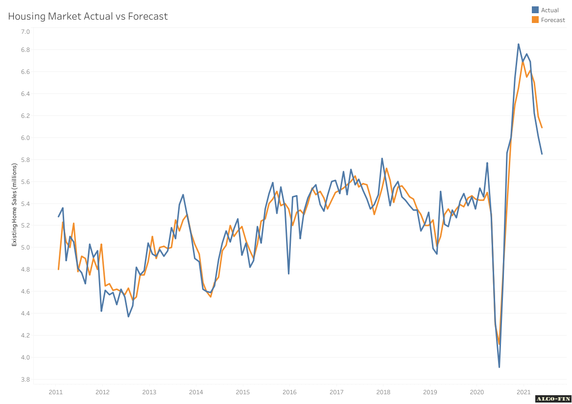
Housing Market Forecast vs Actual
The graph below shows the existing home sales forecast data vs actual data month-on-month over the past 5 years. The most striking aspect of this graph is the significant fall off towards the start of the covid pandemic. Since then, we have seen a sharp recovery and what appears to be the start of a return to normal levels. As expected with any form of economic data that carries a forecast with it, there is no consistency with under or over-forecasting the figures. On numerous occasions, when the experts over-forecast a release, they tend to adjust and under-forecast the following month’s.
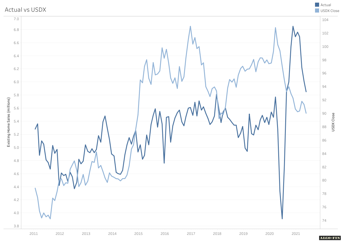
Existing Home Sales vs US Dollar Index
The US Dollar Index is a representation of the USD against a weighted combination of other world currencies. The goal of this index is to provide an indication of the overall strength of the Dollar, essentially normalising it for the performance of other countries since it is measured against multiple others. The USDX uses 100 as its base value (110 therefore meaning that the USD has appreciated on average 10% against the collection of currencies) with the following % composition in the weighting:
EUR - 57.6%
JPY - 13.6%
GBP - 11.9%
CAD - 9.1%
SEK - 4.2%
CHF - 3.6%
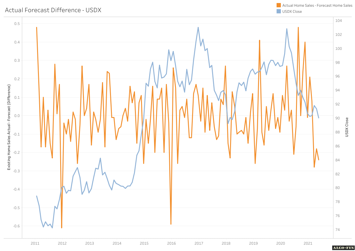
Home Sales Actual - Forecast (Difference) vs USDX
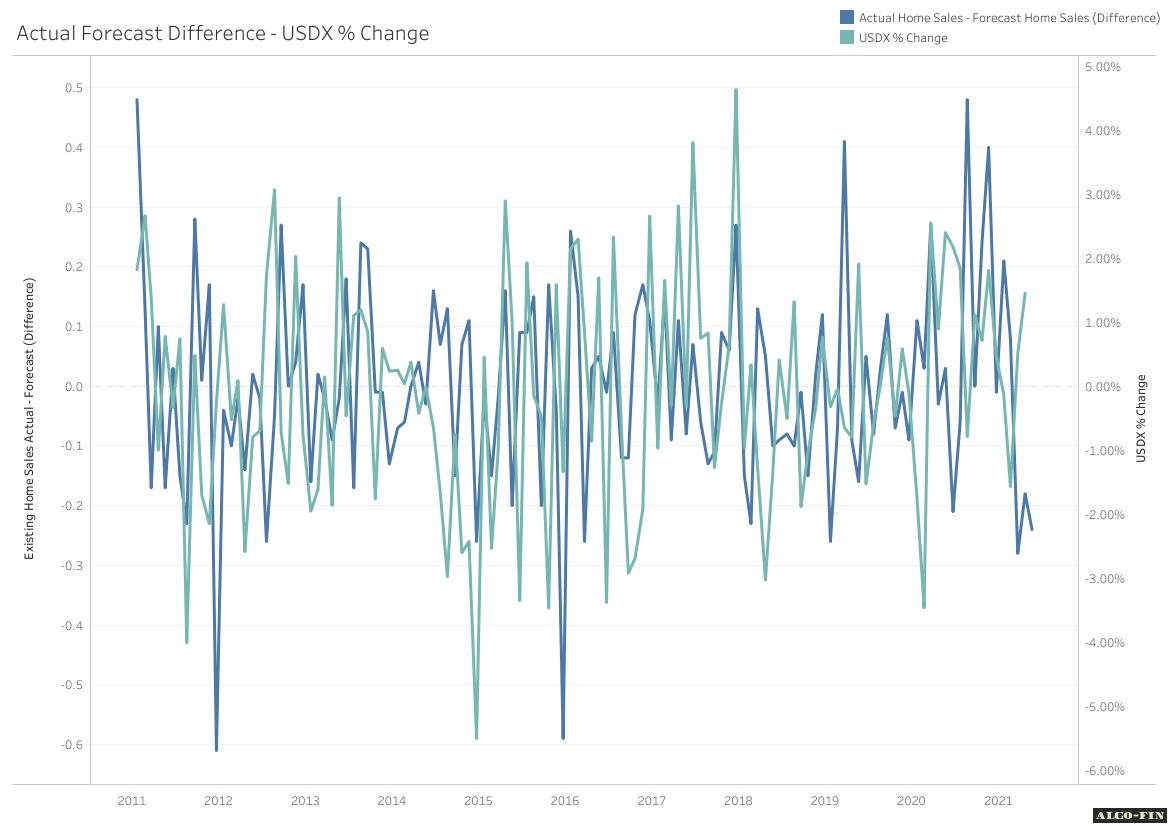
When trying to estimate the effect of an economic announcement on the forex market, we usually consider the announcement relative to its forecast. If an announcement falls short of its expected value, the sentiment is often negative, regardless of whether there is a positive change in that economic component. The graph below takes this concept and calculates the difference between the actual value and the forecast and plots it against the USDX.
% Change
In order to visualise month-on-month change in the currency markets, we need to calculate % change, instead of displaying the raw prices. The following two graphs take the same figures that we did previously for existing home sales (actual - forecast) and plots against them against the % change between the release dates of the home sales figures for both the USDX and EURUSD.