How to Calculate and Analyse Autocorrelation
The term autocorrelation is used to refer to the correlation between observations in the same time series. Essentially, an autocorrelated time series is one that is correlated with a lagged version of itself.
This is hugely important for the discovery of cyclical trends in a dataset. It helps us establish whether we can predict a repeated underlying pattern and add our residual variations on top of this. This can significantly help us in building our forecasts, because it provides the building block of any time series analysis -> the trend.
Autocorrelation is a summary statistic of our data. In order to define it, we have to discuss its components, which are in themselves, also summary statistics.
The expectation of a variable x is the mean value of that variable, denoted as E(x) or the greek symbol mu.
The variance of a variable is a measure of the spread of the data, specifically the expectation of the deviations from the mean squared, denoted as Var(x) = E[(x - mu)^2].
The standard deviation is another and more common metric for the spread of the data, since its units is the same as the data itself. It is represented by the greek letter sigma and calculated as the square root of the variance.
The covariance tells us how much two variables vary together, or “co-vary”. This is a useful measure to understand how two variables are correlated and is calculated using the following formula -> sigma(x,y) = E[(x - mu_x)(y - mu_y)].
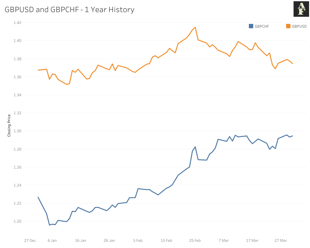
An issue with our covariance measure is similar to that of the variance, in that this metric does not give us any comparable information. As an example, if you take the previous year of GBPUSD and GBPCHF prices, plotted below and calculate their covariance, we get a figure of 0.000382. This doesn’t tell us too much, there’s no limits for the values, all we can infer is that these two variables move together, since our covariance is greater than 0.
Enter correlation, which standardises our covariance by dividing it by the product of our two standard deviations. This ensures that our figure now has a minimum value of -1, a maximum value of +1, which makes it far easier for us to compare values. The correlation between GBPUSD and GBPCHF for the past year is 0.7514, which makes far more sense given the chart.
Autocorrelation requires one parameter, a lag k, the number of time steps our original time series is shifted to create our new one. We then calculate the correlation between these two time series using the same method just described, returning a figure, as before, in the range of [-1,1].
Python Implementation and Visualisation
In Python, we make use of the statsmodels package to run an autocorrelation calculation and visualisation, abbreviated as an acf plot. We can pass a parameter lags to the plot_acf() method which sets the max lags we wish to calculate autocorrelation for. The code below shows the implementation of this.
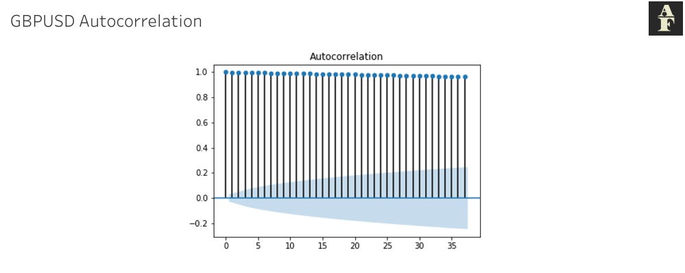
The shaded blue figure shows us a 5% significance boundary. If we observe a correlation outside this value, this indicates that we have enough evidence to suggest significant autocorrelation within our dataset.
Important Points
The inference from autocorrelation is not as simple as just finding the lag value with the highest correlation number. There are a few concepts that we should be aware of when we are analysing acf graphs.
Every lag contains the same dataset used in our calculations, so if we have one lag (other than 0, since the correlation for this would always be 1) that has a correlation significantly outside our boundary, we expect subsequent values to follow suit and also show high correlation. For us as analysts, this is not an ideal situation, when you look at the GBPUSD acf plot below this becomes apparent. We’ve taken almost 2 decades of history of incremental changes between each time period and the result of this is that our legs are all very close to 1. I will go into this in some more detail in next week’s article on Random Walk Models, where I will provide the formula to explain exactly how this phenomenon arises.
The kind of chart we see above doesn’t give us much direction in terms of building a forecast and the reason for that is because we can’t tie any autocorrelation to an external variable. When we see a time series that shows high correlation for certain lags, we need to be able to understand why those lags occur from a logical perspective. If we can’t explain the reason behind the correlation, then we don’t have a sophisticated model we can build, because in that case all we’re doing is using past data to try and predict future data without any additional intelligence.
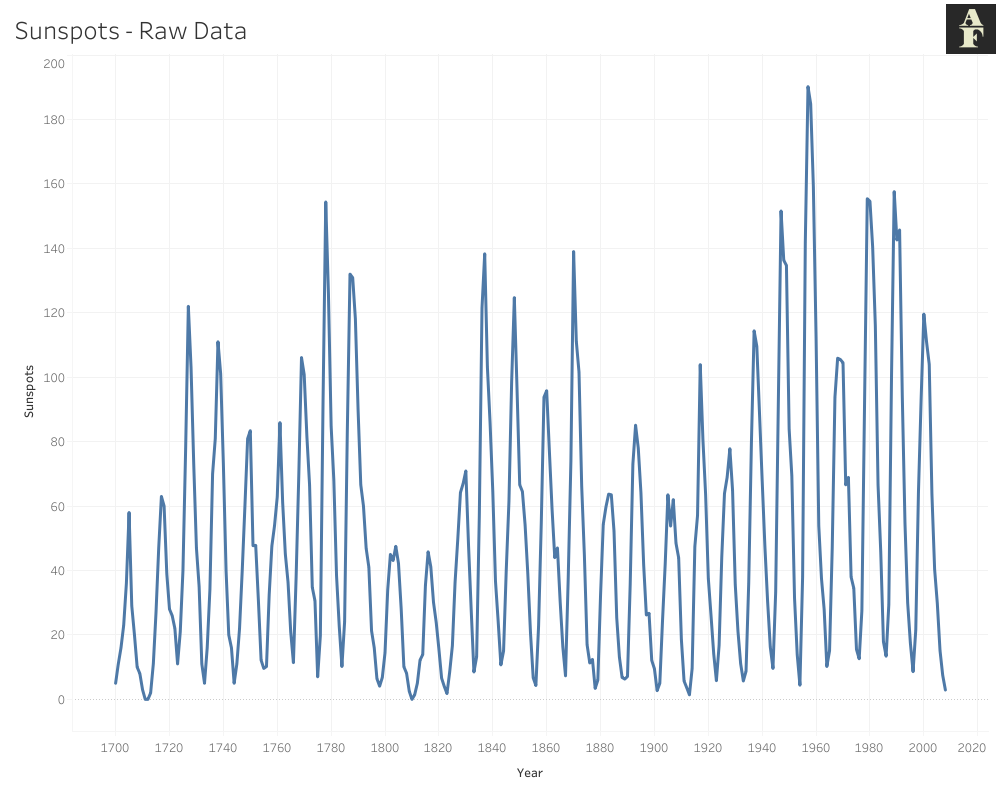
As an example, take the dataset visualised below, which measures the number of sunspots each year over 3 centuries (1700 - 2008). Roughly every 11 years, the magnetic field of the sun flips and the north and south pole essentially switch places. At the beginning of each cycle, the sun has the lowest number of sunspots, whilst during the middle period it has the highest. This has become a measure of identifying how far through its Solar Cycle the Sun actually is.
The point I’m trying to raise through this example is that we have an external cause here. When we look at the autocorrelation charts, we see significant positive correlation at lags 10 and 11 and then 21 and 22. A chart like the one we see here is far more beneficial to an analyst because we have an underlying reason for why specific lags reject our initial hypothesis.
Autocorrelation isn’t always guaranteed to give you insights that will help you create a model. However, it is useful to check if your time series is at any point in time repeating past behaviour, because a deeper study might reveal more similarities between periods of economic activity that you can then use for future analysis and forecasts.
This article is inspired by the information from Chapter 8 of Advanced Algorithmic Trading by Michael Halls Moore on Serial Correlation.
Information on sunspots was provided by the following website on the Solar Cycle.

