Algorithmic Trading Models - Machine Learning

In the fifth article of this series, we will continue to summarise a collection of commonly used technical analysis trading models that will steadily increase in mathematical and computational complexity. Typically, these models are likely to be most effective around fluctuating or periodic instruments, such as forex pairs or commodities, which is what I have backtested them on. The aim behind each of these models is that they should be objective and systematic i.e. we should be able to translate them into a trading bot that will check some conditions at the start of each time period and make a decision if a buy or sell order should be posted or whether an already open trade should be closed.
Please note that not all of these trading models are successful. In fact, a large number of them were unsuccessful. This summaries series has the sole objective of describing the theory behind different types of trading models and is not financial advice as to how you should trade. If you do take some inspiration from these articles, however, and do decide to build a trading bot of your own, make sure that you properly backtest your strategies, on both in and out of sample data and also in dummy accounts with live data. I will cover these definitions and my testing strategies in a later article.
Introduction
I’ve written 4 articles on theoretical concepts behind algorithmic trading models. The previous articles have covered breakouts, moving averages, oscillators and cyclical methods. The 5th model type, machine learning methods, is considerably more involved due to the scope of the topic and so this article is definitely not designed to be a white paper on the only way ML can be used in algorithmic trading. My goal in this article is to provide one framework that incorporates some form of computer learning to predict future prices of the GBP/USD rate. You can consider this part 1 of Algorithmic Trading Models — Machine Learning, because there’s a huge scope that can be covered in this topic that I wouldn’t be able to in one article and I will be writing more with alternate ideas in the future.
Since this is the first article in this series, I want to outline a fairly straightforward application, using a Linear Regression. My aim is to produce an algorithm that identifies minimum and maximum points in the closing prices of the GBP/USD exchange rate. I have roughly 17 years of data from Yahoo Finance, 70% of which will be used for training and the remaining 30% for testing. It’s worth noting here that the algorithm produced is as a result of no parameter tuning or evaluation, it’s more an opportunity to expose potential starting points for designing a project like this.
Methodology
This method begins with the Zig Zag indicator, which can be found on most well-known charting platforms. The Zig Zag Indicator is a lagging indicator that identifies minimum and maximum points in a graph. It marks a maximum point as soon as the chart has fallen by a pre-defined percentage and marks a minimum point when the chart has risen by a pre-defined percentage. Connecting these points by straight lines gives us the historical shape fluctuations of an asset, with the noise stripped away. An example of this is shown in the image below.
I wrote the code for this project in Python and there’s a straightforward Python package for generating the Zig Zag indicator that you can access here. You have to pass a NumPy array into the .peak_valley_pivots() method, which returns an array with a 1 for maximum points, -1 for minimum points and 0 for all other points.
from zigzag import *
import pandas as pd

#Collect data into dataframe
...
#Convert data into numpy array
closing_prices = np.asarray(df[‘Close’])

#Calculate min/max points
min_max_points = peak_valley_pivots(closing_prices, 0.02,-0.02)

#Add as a column to the original df2
df[‘Min/Max Points’] = min_max_points
Once we have the minimum and maximum points, we can create the lines to connect them using the pandas .interpolate() method, using linear interpolation which will take all points between each 1 and -1 and assign points of equal distance between them.
#Replace all 0s with NaN values
df['Min/Max Points'] = df['Min/'Max Points'].replace(0,np.NaN)#Interpolate
data['Min/'Max Points'] = data['Min/'Max Points'].interpolate(method = 'linear')
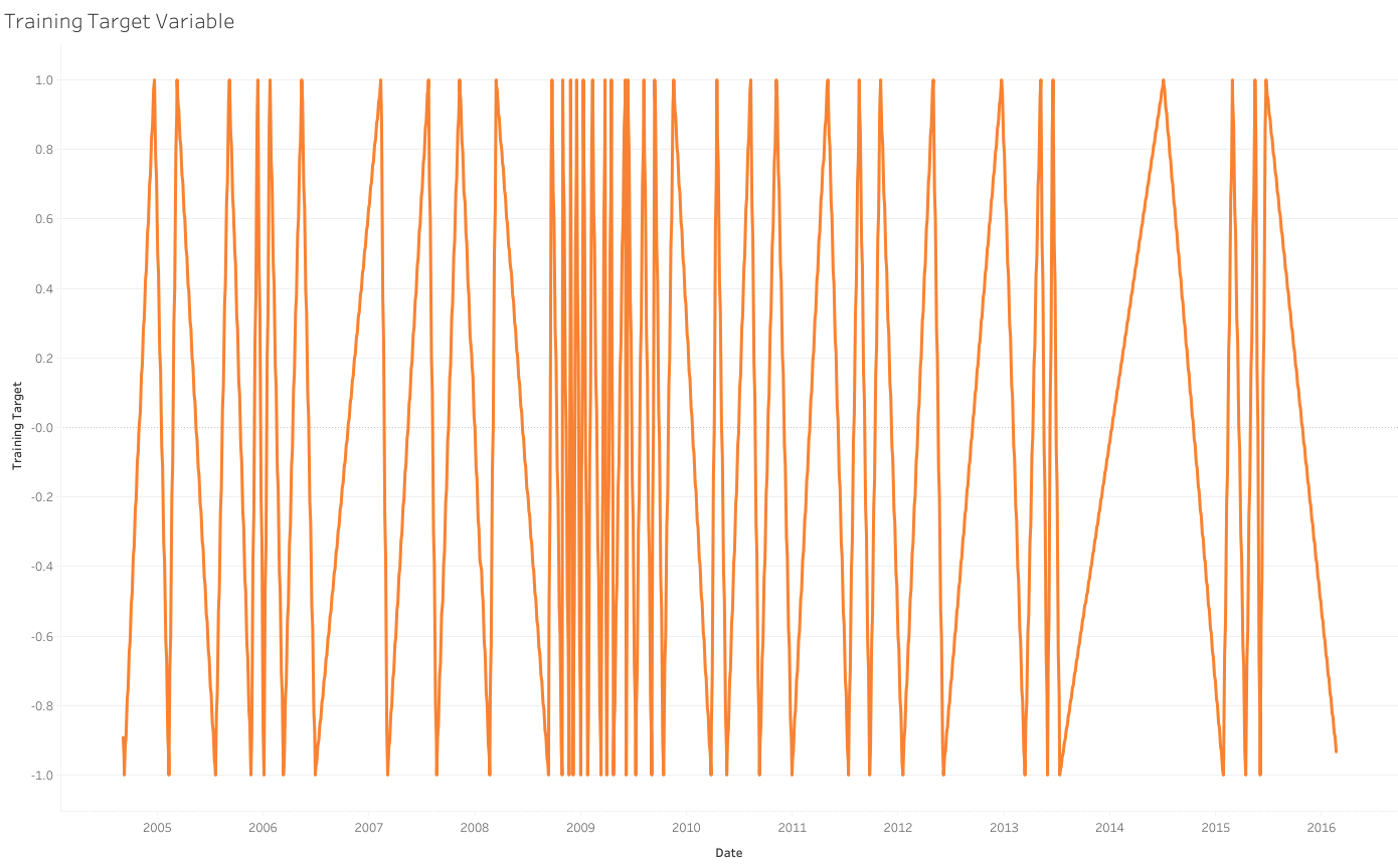
This will create a graph that looks like the following.
This will form our outputs. We want to try and emulate this shape as closely as we can because we know as our model reaches 1, we are closing in on a maximum point in the graph and as we are reaching -1, we are nearing a minimum points. The closer our model gets to either of these values, the more we should be focusing on trying to identify a reversal.
Once we have our target variable, the next job is to create our inputs. This is where the experimentation can begin because there’s no hard and fast rule as to what your inputs will be. In fact, this is where the problem gets most difficult because if you’re trying to build a model that has an edge, you need to provide it with more than just historical prices, especially if you are using a simple model like a Linear Regression. I’ll discuss potential adaptations and benefits of using more complex models further down in the article, but to highlight the previous point even further and also since this is the first experimentation with ML modeling in finance, I did take a series of historical trend statistics as my inputs. In particular, I used the prices from each of the previous 5 days and the 5, 10, 50, and 200-period simple moving averages as my inputs, after having normalized this column for each individual year of data. This creates a data frame that looks something like this.
Results
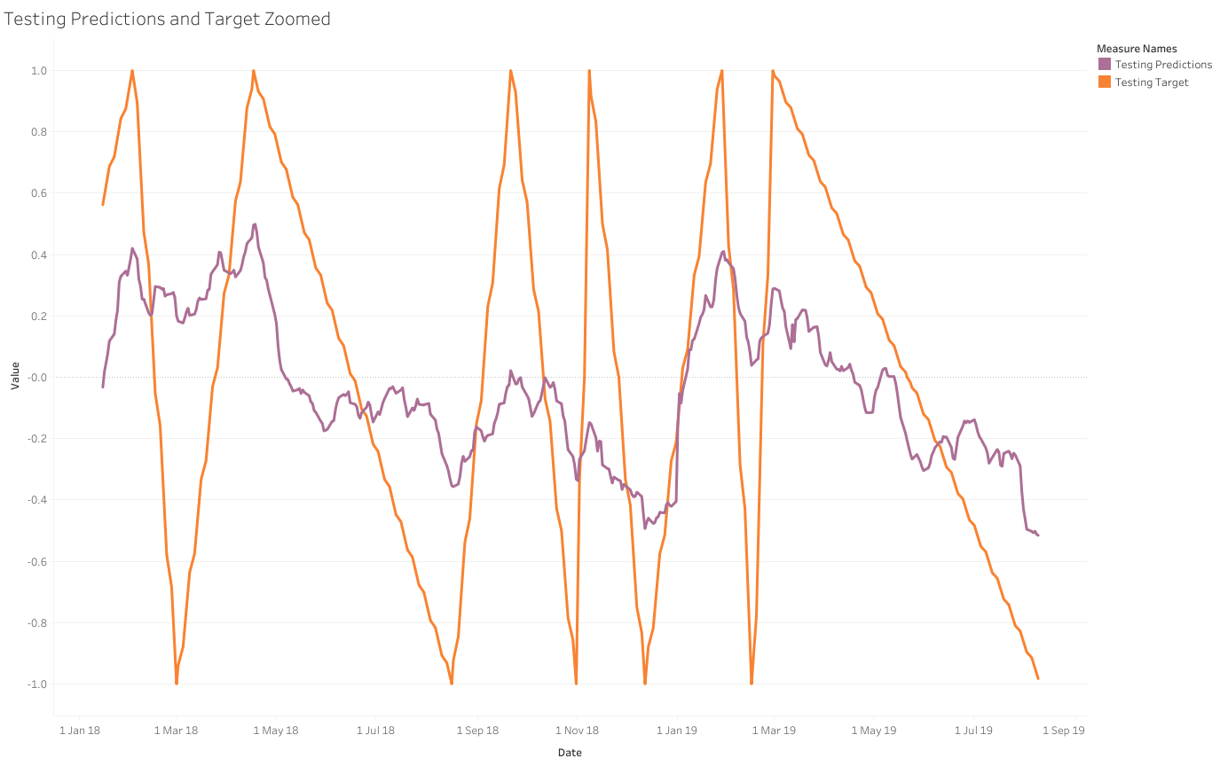
70% of the data was used for training and 30% was used for testing. I have presented the entire results of how the targets line up with the predictions for both the training and testing data and zoomed snapshots of this data as well to make the two lines slightly clearer.
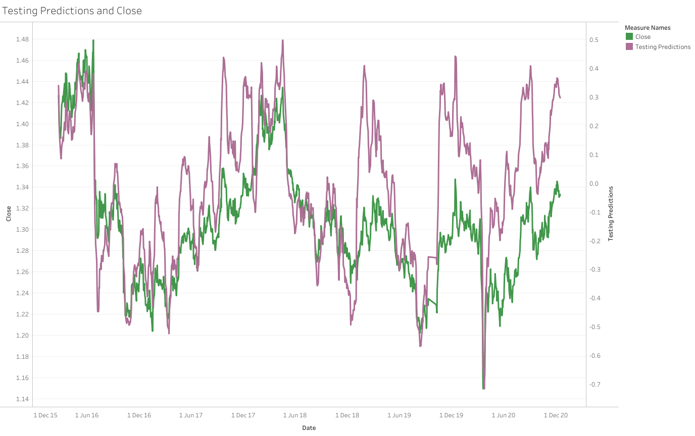
Another interesting graph is to see how the predicted values line up against the actual closing prices on a dual-axis. The predicted values fluctuate between 1 and -1, which explains why we need to plot these two values on different scales.
Comments
When looking at the previous graphs, one thing that is clear is that we are let down significantly by the complexity of the model. The Regression seems unable to capture the extreme values of the target variable, as it fluctuates between 0.6 and -0.6.
What we do see with the target variable and the closing prices however is that, for the large part, the graphs seem to align reasonably well. This comparison is not about the lines being directly on top of each other, because that is simply down to readjusting the axis scales, but more observing the actual shape of the data. When we reach a minimum or maximum point in the closing prices, the prediction also appears to mimic this.
To develop this idea, I would be looking into the performance of a more sophisticated model, like a neural network or a random forest. The ability to add more layers brings with it an opportunity to analyse deeper relationships in the data and might give us a better estimate of our Zig Zag indicator. I would also look into the quality of our inputs. Simple moving averages give us an indication of trends, but are lagging indicators and won’t give us too much information about whether we are near a turning point or not. One adaptation might be to use the value of different oscillators in our inputs, as they give us a figure for the current price in relation to historical data.


