
A Case Study - AUDUSD


The goal of this newsletter has always been to provide what, in the current way information is delivered, an alternate lens to observe the forex markets from a retail perspective. What I mean by that is that the forex field is currently dominated by a form of analysis, and that’s technical analysis. “Gurus” teaching you how to draw support and resistance on charts, or how to identify different patterns that can then allow you to make a decision on future direction.
I’ve never found much success solely using technical analysis. It doesn’t answer the why and if you want to replicate your success over a period of time, the why is essential. When it comes to tracking any errant trades that you make, or incorrect decisions that you make, knowing why you’ve made them enables you to avoid making them again. With fundamental analysis which is concerned with overall economic behaviour, that’s a slightly easier factor to understand than it is with technical analysis. Knowing why a head and shoulder pattern didn’t proceed in the direction you expected is much more difficult to decode than if you had overstated the impact of US inflation on the GBPUSD, for example.
Throughout the process of understanding and visualising each new fundamental analysis component, as we have been doing for the past couple of months, it’s worth attempting to translate this into charts from time to time and see how economic data stacks up against what is actually happening in a currency pair. That’s the purpose of this week’s article. I want to run through the one week performance of a currency pair and use the economic announcements from that week to see if the data aligns with the expected direction.
It’s worth mentioning that this kind of analysis is not complete in any form. We’re looking at a single week in isolation without much regard for anything outside this timeframe. That shouldn’t dissuade us from this exercise, however, because even if we can draw some links between economic performance and currency pairs, then we know that we have a foundation of understanding from which to build on.

Above is one of the charts that our Algo-Fin twitter account sends out on a weekly basis. We have two tables like this, one which summarises the previous week’s economic activity and another which looks ahead to the next week’s announcements. We’re looking at the week of July 13th - July 16th and the currency pair I’m using in this example is the AUDUSD.
We can begin by isolating the announcements that is specifically relevant to that pair, which gives us 6 unique releases. In a previous article I mentioned that, when it comes to translating any of these numbers to the market, we aren’t just looking for the raw figure itself, but also its comparison to the forecast. The forecast is the figure economists believe is appropriate given market conditions at the time and they will react more aggressively to whether they are right or wrong, as opposed to what the actual figure is. With that in mind, we can take each of our 6 releases and add a tag to each of them, to say whether they have exceeded or underperformed their estimate.
AUD - July 13 - NAB Business Confidence - Underperform
USD - July 13 - Inflation Rate YoY - Exceeds
USD - July 13 - Core Inflation Rate YoY - Exceeds
AUD - July 14 - Westpac Consumer Confidence Index - Exceeds
USD - July 14 - PPI MoM - Exceeds
USD - July 16 - Retail Sales - Exceeds
Our result is what looks to be a fairly strong bias toward the USD. We have AUD falling short on one of its announcements and exceeding the other, whilst the USD exceeds all 4 of its economic announcements.
Another factor that we have to consider is the significance of each of these announcements. There’s no hard and fast rule for how much impact a specific economic release will have, as it’s usually something we have to determine by trial and error (looking at different releases across a large period of time and estimating their impact). With a working knowledge of global economics, however, there are a couple of assumptions that we can make:
The USD has a larger sway in the AUDUSD than AUD - the US economy is significantly larger than the Australian one. Because of this and because of the significance of the US economy in world trade, any economic news coming out of the US tends to reverberate far stronger around world economies than news coming out of Australia. That’s not to say our Australia economic announcements don’t have an impact and we’ll show in the forex charts that they in fact still do, but when a giant like the US is brought into the question, we tend to pay a little more attention to their economy that the opposite currency
Inflation releases are more important that consumer indexes - inflation maintenance is one of the building blocks of an economy and because of this, they hold huge importance in the direction that both the economy and currency are headed. Inflation is significantly more important than either the Business Confidence Index or the Consumer Confidence Index that was released in relation to the Australian economy. These indexes are based on surveys of managers and whilst they are important figures, they tend to be a little more related to the long term performance of an economy and they are based on sentiment, as opposed to a tangible datapoint that describes the economy
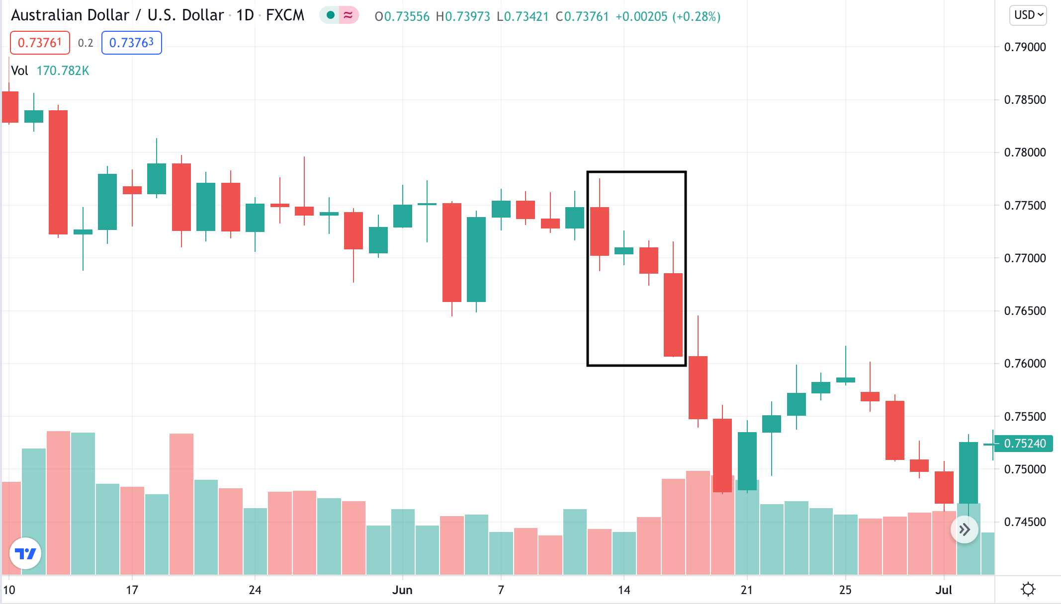
The box in the graph above represents the 13th July - 16th July for the AUDUSD. As expected, over the course of this week, we see the currency pairs take a steep fall, which representing a rise in the value of the USD and simultaneous fall in value of the AUD. This aligns with both our assumptions and releases above. We believe the US economy will have a more significant impact on this chart than the Australian one. We also believe that the US releases are more scrutinised and impactful on the currency pair than the Australian ones. Finally, combining that with the actual releases, we see a strong performance for the week in question for the USD and a satisfactory one for the AUD. We can then match this information to the charts and see that our initial beliefs were confirmed. An interesting point to add here is on the performance on the 14th July, in which we saw the Australian Consumer Confidence Index outperform its forecast and the US PPI also outperform its forecast. Our result is essentially no movement, with a slight bias to the AUD side. Of course, we can’t be more specific than that in assigning the influence of these economic releases to specific moments in a chart, due to the nuances that exist within these markets that we aren’t currently accounting for.
The price of the currency pair is ultimately determined by supply and demand and there could be hundreds of other small “happenings” in an economy that pushes this figure either way. It’s also important to note that this is not a trading strategy -> this analysis suffers from look-ahead bias, in which we need to see future performance in order to confirm our theories. What this exercise does do however, is to confirm that our economic logic is something that we can translate to the markets and that fundamental analysis does have a place in forex trading and analysis.
I will look to periodically publish more articles like these that aim to provide a more live and current application of our theoretical knowledge. In the meantime, you can check us out on Twitter by clicking on the tweet below, which lists the economic releases from last week.
